Book Covers

Meinos Kaen

Well-Known Member
#1
Let's face it, it's what first makes us stop if we're book-browsing. What are your favourite ones? What qualities/colour do you like? Do these details change with the genre?

Latest cover I really liked is this one of Frozen earth.


I love the mesh of whites and blues. Never seen a glacier so beautiful, and it fits a book talking about the effects of Ice ages on the world.
 

mortalone

Well-Known Member
#3
Baen's book covers!!!!!!


Just kidding.

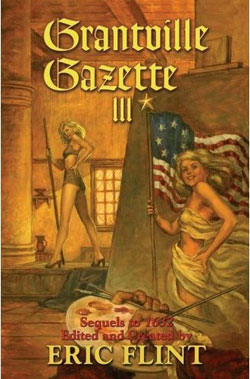
Although a few of them actually are good, e.g. the ones from the 1632 series:


And my favorite cover from the series:


Okay, enough Baen covers. I really like the covers made by the artist who did this one:


Great cover art to a great series.
 

Meinos Kaen

Well-Known Member
#4
Well, thought I'd revive this thread with the cover of my own book! Give me an opinion, guys.


Ain't my illustrator just the best?
 

Glimmervoid

Well-Known Member
#6
I'm a big fan of the Rivers of London cover.

It's classy, stylish and just plain interesting. Its much better than the abomination the US got.
 

Meinos Kaen

Well-Known Member
#7
zerohour said:
You've got a book? Give us the details man!
It's coming out on the 1st of June on Amazon, it's called Children of the New Era. To sum it up briefly, it's a Sci-Fi set in a future where... Well, think V for Vendetta meets X-Men.

If you want to be an advance reader, give me a whistle. :p (That doesn't mean beta. Means 'you get to read the book free before everyone else, on the 1st of June you post a review on its amazon page')

@Glimmervoid: Damn. Talk about change. Did they change the title and the cover?
 

Glimmervoid

Well-Known Member
#8
Meinos Kaen said:
@Glimmervoid: Damn. Talk about change. Did they change the title and the cover?
Yep. Also in the book the main character is black (or mix African British to be exact). Notice how the American cover goes out of its way to hide that fact. I mean, I not saying it needs to be shouted out (the UK cover doesn't even show the main character) but they actually changed the American version to hide the fact. Here's the first version.
 

Meinos Kaen

Well-Known Member
#9
Glimmervoid said:
Meinos Kaen said:
@Glimmervoid: Damn. Talk about change. Did they change the title and the cover?
Yep. Also in the book the main character is black (or mix African British to be exact). Notice how the American cover goes out of its way to hide that fact. I mean, I not saying it needs to be shouted out (the UK cover doesn't even show the main character) but they actually changed the American version to hide the fact. Here's the first version.
Sigh, America... Didn't Will Smith and Denzel Washington teach you that having black mains doesn't matter?
 

zerohour

Well-Known Member
#10
Meinos Kaen said:
zerohour said:
You've got a book? Give us the details man!
It's coming out on the 1st of June on Amazon, it's called Children of the New Era. To sum it up briefly, it's a Sci-Fi set in a future where... Well, think V for Vendetta meets X-Men.

If you want to be an advance reader, give me a whistle. :p (That doesn't mean beta. Means 'you get to read the book free before everyone else, on the 1st of June you post a review on its amazon page')

@Glimmervoid: Damn. Talk about change. Did they change the title and the cover?
Hell yeah I'll do that! Hook me up!

Though you publishing a book reminds me we should probably get a Original Fic Resource thread going.
 

Meinos Kaen

Well-Known Member
#11
zerohour said:
Meinos Kaen said:
zerohour said:
You've got a book? Give us the details man!
It's coming out on the 1st of June on Amazon, it's called Children of the New Era. To sum it up briefly, it's a Sci-Fi set in a future where... Well, think V for Vendetta meets X-Men.

If you want to be an advance reader, give me a whistle. :p (That doesn't mean beta. Means 'you get to read the book free before everyone else, on the 1st of June you post a review on its amazon page')

@Glimmervoid: Damn. Talk about change. Did they change the title and the cover?
Hell yeah I'll do that! Hook me up!

Though you publishing a book reminds me we should probably get a Original Fic Resource thread going.
Yeah, we should. And check your PMs. :p
 

bluepencil

that's why it's trash can, not trash cannot
#12
Book covers should be bold and eye-catching. Meinos, just to illustrate what I mean:


Pumped up contrast, drew in the focus. The present cover to me felt too comic-bookish.

A bit too gray and hesitant. The art is nice, but you're not there to sell the art. Why keep all the details? The cover's there to catch attention.

[edit]
Also just noticed, the mother on the left(?) lacks breasts. ;) Chest too flat, unless this is... being progressive?
 

Meinos Kaen

Well-Known Member
#13
bluepencil said:
Book covers should be bold and eye-catching. Meinos, just to illustrate what I mean:


Pumped up contrast, drew in the focus. The present cover to me felt too comic-bookish.

A bit too gray and hesitant. The art is nice, but you're not there to sell the art. Why keep all the details? The cover's there to catch attention.

[edit]
Also just noticed, the mother on the left(?) lacks breasts. ;) Chest too flat, unless this is... being progressive?
The point was for it to be comic-bookish, actually. And sorry if I sound rude, but the explosion of light there completely destroys the mood the cover is supposed to convey. In my opinion covers aren't supposed to be 'bold and eyecatching', they're supposed to give you a hint of what's in the book, and my story is anything but flashy. I send you back to the cover of Rivers of London.

And about the breasts thing, please observe the hair on the two adult figures and then slap yourself in the forehead when you realize that the woman is supposed to be the one on the right. XD ... Oh, wait, the question mark. Again, I'm not here to sell based on flashiness and to pander to the common demoninator. The focus of the cover is supposed to be the submissive but angry kid, not the mother in the back.
 

MastaofBitches

Well-Known Member
#14
 

MastaofBitches

Well-Known Member
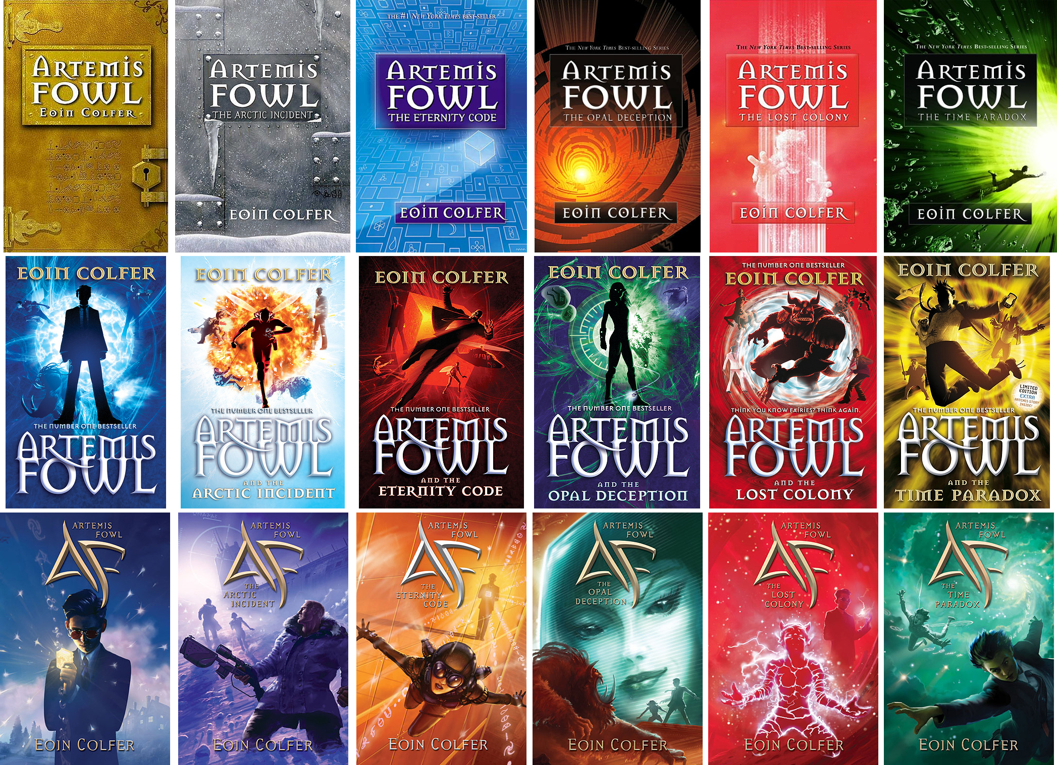
#16
Is that better?
 

MastaofBitches

Well-Known Member
#18
Yeah, for some reason though my copy of the Eternity Code isn't there.
 

goldenarms

Well-Known Member
#19
Meinos Kaen said:
Glimmervoid said:
Meinos Kaen said:
@Glimmervoid: Damn. Talk about change. Did they change the title and the cover?
Yep. Also in the book the main character is black (or mix African British to be exact). Notice how the American cover goes out of its way to hide that fact. I mean, I not saying it needs to be shouted out (the UK cover doesn't even show the main character) but they actually changed the American version to hide the fact. Here's the first version.
Sigh, America... Didn't Will Smith and Denzel Washington teach you that having black mains doesn't matter?
You didn't hear about the controversy of The Hunger Games, did you?

Seriously, some people have confessed Rue's death suddenly became less tragic just because they found out she was really black all along. There's something wrong there.
 

Meinos Kaen

Well-Known Member
#20
goldenarms said:
Meinos Kaen said:
Glimmervoid said:
Meinos Kaen said:
@Glimmervoid: Damn. Talk about change. Did they change the title and the cover?
Yep. Also in the book the main character is black (or mix African British to be exact). Notice how the American cover goes out of its way to hide that fact. I mean, I not saying it needs to be shouted out (the UK cover doesn't even show the main character) but they actually changed the American version to hide the fact. Here's the first version.
Sigh, America... Didn't Will Smith and Denzel Washington teach you that having black mains doesn't matter?
You didn't hear about the controversy of The Hunger Games, did you?

Seriously, some people have confessed Rue's death suddenly became less tragic just because they found out she was really black all along. There's something wrong there.
... I knew there was a reason why I didn't want to associate with Hunger Games fans.
 

goldenarms

Well-Known Member
#21
Meinos Kaen said:
goldenarms said:
Meinos Kaen said:
Glimmervoid said:
Meinos Kaen said:
@Glimmervoid: Damn. Talk about change. Did they change the title and the cover?
Yep. Also in the book the main character is black (or mix African British to be exact). Notice how the American cover goes out of its way to hide that fact. I mean, I not saying it needs to be shouted out (the UK cover doesn't even show the main character) but they actually changed the American version to hide the fact. Here's the first version.
Sigh, America... Didn't Will Smith and Denzel Washington teach you that having black mains doesn't matter?
You didn't hear about the controversy of The Hunger Games, did you?

Seriously, some people have confessed Rue's death suddenly became less tragic just because they found out she was really black all along. There's something wrong there.
... I knew there was a reason why I didn't want to associate with Hunger Games fans.
Some people just don't know how to read and comprehend stuff at the same time. Blaise Zabini from Harry Potter had people kind of making what he looked like up for their stories all the time, including some who thought Blaise was a blonde-haired-blue-eyed gorgeous girl. My best friend told me the things HP fans were going on and an about, and I was like, "Um, dude, Blaise is black. A black boy. Seriously, it said it at the end of The Sorting in the first book."

People read about characters with dark skin, and somehow it doesn't really connect that the character is actually black. They seem to think it's a white person with a really good tan.
 

Meinos Kaen

Well-Known Member
#22
Hey, guys. Back again needing the opinion of someone I trust.

I realized that my illustrator is a professional illustrator but not a great typesetter. So, I went and contacted a professional typesetter who sent me back three cover concepts... And I can't decide which one to take!

So, what do you think? Which one is the best? I'm kind of partial to the first.


Glimmervoid

Well-Known Member
#23
I like the third best. Your name is hard to read on the second (the shifting colour means the edges don't stand out) and in the first, the title fades into the background. The third is clear and the title jumps out at you. The first would be my second choice, though.
 

Meinos Kaen

Well-Known Member
#24
Glimmervoid said:
I like the third best. Your name is hard to read on the second (the shifting colour means the edges don't stand out) and in the first, the title fades into the background. The third is clear and the title jumps out at you. The first would be my second choice, though.
Yeah, sounds good... On my blog, someone said

If you do go with the third, I would experiment more with the font size and kerning... Maybe try moving some of that text to the top, like option
What if I made her use the third's colours with the first's positioning?
 

Shirotsume

Not The Goddamn @dmin
#25
"What if I made her use the third's colours with the first's positioning?"

I like the first best, just not with those colors.

The third's colors stick out, but don't seem to match the theme of the cover- I don't know if that's a good thing or not.
 
Top